
Back
Why Every Vibe-Coded Website Looks the Same (And How to Fix Yours)
You can ship a working app in 20 minutes with AI. But open 10 vibe-coded landing pages side by side - you can't tell them apart. The code works. The design doesn't. Here's why, and a free SKILL .md 🎁 file at the end to fix it.
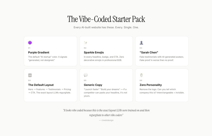
The Vibe-Coded Landing Page Starter Pack
1. Purple gradient - AI was trained on 2022-2023 website data when purple was trending. Now every vibe-coded site has purple in the background, CTA, pricing section - everywhere.
2. Sparkle emojis - Headings, badges, CTAs. AI can't help itself.
3. Fake testimonials - AI generates them because you're not feeding it real data. Every testimonial is generic and obviously fake.
4. The default layout - Hero → Features → Testimonials → Pricing → CTA. Every single time. Your layout should be based on what you're selling, not what the LLM was trained on.
5. Generic copy - "Launch faster." "Build your dream." What does that even mean?
6. Zero personality - Remove your logo and you can't tell your site apart from any other vibe-coded platform.
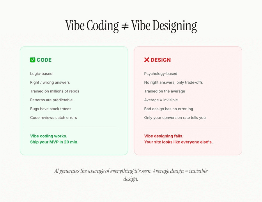
Vibe Coding ≠ Vibe Designing
This distinction matters.
Code is logic-based. Right/wrong answers. Trained on millions of repos. Bugs have stack traces. Code reviews catch errors. Vibe coding works - you can ship an MVP in 20 minutes.
Design is psychology-based. No right answers, only trade-offs. It impacts your conversion rate but you won't know instantly like you do with code. There's no error log for bad design.
AI generates the average of everything it's seen. Average design = invisible design.
3 Things AI Gets Wrong Every Time
Visual hierarchy - AI treats everything equally instead of creating deliberate focus.
Trust signals - AI doesn't know your social proof or what your audience needs to see.
Differentiation - If you haven't told AI exactly what makes you different, it pulls up average data and your site looks like everyone else's.
The 5-Second Test
Show someone your website for 5 seconds. Then ask:
1. What does this company do?
2. Would you trust them with your money?
3. Can you tell this apart from competitors?
If the answers are vague, your site has a problem.
The Fix: SKILL .md
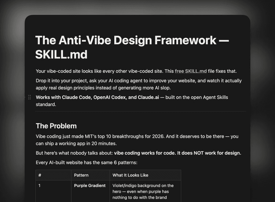
Get the SKILL .md framework (free): Click Here
I built a single file you can drop into your codebase. It tells AI what your brand is, detects all the anti-patterns above, and validates your output before you ship.
One file. One prompt: "Based on this SKILL .md, improve my website."
The before/after difference is night and day. Your site stops looking like a template and starts looking like a $3M funded company should.
Your seed round funded website should never look like a free template. In a world where everyone can cook up a site in minutes, taste is the only differentiator.
Read More

Design Is the New Code
60 million people read Matt Shumer's post this week. The one where the CEO of an AI company said AI already does all of his technical work. That he walks away from his computer for four hours and comes back to find the job done. Done well.
He's right. But he missed something.
Everyone's panicking about AI replacing their skills. Writing. Coding. Analysis. And yeah that's happening. But here's the thing nobody's talking about:
When everyone can build anything, everything starts looking the same.
I work with SaaS and tech companies every day. I build their websites, their products, their brands. And I'm watching something happen in real time that should terrify every founder reading this.
Your competitor the one you've been outpacing for two years because your engineering team shipped faster, just caught up. Not because they hired better people. Because they pointed an AI agent at their codebase and shipped your entire roadmap in a weekend.
Features are no longer a moat.
Let that sit for a second.
The thing that used to take your team six months the integration, the dashboard, the workflow automation can now be built by a solo founder with Claude and a cup of coffee. The gap between "we have this feature" and "they have this feature" just collapsed from months to days.
So what's left?
AI has a design smell.
Jordan Singer said something recently that I can't stop thinking about:
"AI has a design smell because it's 'designing' via code. We can tell."
He's right. You can feel it. You land on a SaaS homepage and something's... off. It's technically fine. The layout works. The copy is grammatically correct. The colors don't clash. But it feels like it was assembled, not designed. Like a house where everything's from IKEA each piece is fine alone, but the whole thing has no soul.
That's the smell. And your customers can detect it even if they can't articulate it.
Here's the uncomfortable part: most SaaS founders think their site looks great. They used a template or had AI generate the layout. It has gradients. It has a hero section. It has social proof logos. Check, check, check.
But it looks exactly like the other 400 SaaS sites their potential customer visited this month. And it converts like it, too.
The weird inversion nobody expected
Everyone assumed AI would make design less valuable. That it would automate away the need for designers like it's automating away the need for junior developers.
The opposite is happening.
Think about it like this: When everyone had to hand-code their websites, bad code was the bottleneck. Companies with better engineering teams won. The scarce resource was technical execution.
Now AI writes the code. Technical execution is basically free. So the bottleneck moved. It moved to the thing that determines "what gets built" and "how it feels" when a human uses it.
Design.
Dylan Field put it perfectly: "Design is the new code."
The layer of abstraction is moving up. Code used to be the craft. Now the craft is deciding how something should look, feel, and work. The code just executes that vision. And if your vision is "copy what Stripe did three years ago," congratulations you and every other AI-assisted founder just built the same thing.
What the best SaaS companies already know
Look at the companies that dominate their markets despite having competitors with similar or sometimes better features:
Linear didn't win project management because they had features Jira lacked. Jira has every feature imaginable. Linear won because using it feels different. It's fast. It's opinionated. Every interaction feels like someone cared about the details. That's design.
Notion wasn't the first doc tool or the first wiki tool. It won because it made you feel like you were building something personal. The design communicated flexibility without complexity. That's incredibly hard to do.
Stripe didn't win payments because they processed credit cards better than Braintree. They won because their documentation was beautiful, their dashboard was clear, and their brand felt like the future. Developers chose Stripe because everything about it signaled competence.
Arc entered the browser market one of the most locked-down markets in tech and got people to switch from Chrome. Not with features. With design so opinionated and fresh that using it felt like upgrading to a different era of computing.
None of these companies won on features. They won because they invested in design as a strategic advantage, not an afterthought.
Meanwhile, there are hundreds of SaaS tools with genuinely great technology underneath, buried under confusing navigation, cluttered dashboards, and landing pages that look like they were thrown together during a hackathon. You've never heard of most of them. That's not a coincidence.
The founder's blind spot
Here's something I see constantly that kills me:
A SaaS founder spends 18 months building an incredible product. Real technology. Real value. Then they spend a weekend on the landing page, grab a template, let AI fill in the copy, and launch.
And then they're confused when conversion rates are mediocre.
The product is a Porsche. The website is a cardboard cutout of a Porsche. And they're wondering why people don't want to take it for a test drive.
This is the blind spot: founders optimize for the product and treat the brand as an afterthought. But the brand is what gets someone to try the product. If your homepage doesn't make someone feel something intrigue, trust, excitement they'll never see your beautiful product. They bounced in 4 seconds.
And here's where it gets really painful: AI is making this worse, not better. Because now founders have a faster way to produce mediocre design. They can generate a "good enough" landing page in 20 minutes. And "good enough" is the enemy of memorable.
Design isn't "making things pretty"
When I say design is the differentiator, I don't mean picking nicer colors.
Design is:
How your homepage makes someone feel in the first 3 seconds. Not what it says... how it feels. Professional? Cutting-edge? Trustworthy? Playful? If the answer is "like every other SaaS site," you've already lost.
How your product communicates what to do next without explaining it. Great product design is invisible. Users don't notice it because nothing confuses them. Bad design is visible it's every moment a user pauses and wonders "wait, what do I click?"
How your brand sits in someone's memory 48 hours later. They visited 10 SaaS sites researching a solution. Can they remember yours? Not the name the feeling? That's design.
How trust is built before a single word is read. People judge credibility in milliseconds based on visual design. A polished, thoughtful design says "we care about details." A sloppy one says "we cut corners." Fair or not, that's how human brains work.
The window is closing
Here's the part that should create urgency.
Right now, most SaaS companies are in a race to implement AI features. AI this, AI that. Every product roadmap has "AI" stapled onto it. Which means every SaaS product is about to sound the same in their marketing, offer similar AI-powered features, and compete on the same talking points.
When everyone zigs, you zag.
While your competitors are scrambling to ship AI features that will be commoditized in 6 months, the smartest founders are investing in the one thing AI can't generate: a brand and product experience that feels unmistakably theirs.
Taste can't be automated. Judgment can't be copy-pasted. The feeling you get when you use a product that someone sweated every detail over, that's a human output. And it's about to become the rarest thing in SaaS.
Matt Shumer ended his viral post with "The future hasn't knocked on your door yet. It's about to."
I'd add this: When it does, every SaaS product will be able to do roughly the same thing. The only question is which ones will make you feel something when you use them.
Design is the new code. The companies that figure this out first win.
The rest become a commodity.

@namyakhann

Humans Have Shorter Attention Spans Than Goldfish, Here's What That Means for Your Landing Page
A goldfish has a 9-second attention span.
You have 8 seconds.
Let that sink in. Your potential customers scroll past your landing page faster than a goldfish loses interest in a pebble.
And you're wondering why your site doesn't convert.
Here's what's actually killing your conversion rate (and it's not what you think).
Most founders think short attention spans mean they need to:
Make everything shorter
Add more animations
Scream louder with bigger fonts
They're wrong. Here's the real formula:
Conversion Rate = (Clarity × Relevance) ÷ (Friction + Confusion)
In 8 seconds, visitors are asking three questions:
What is this? (Clarity)
Is this for me? (Relevance)
What do I do next? (Friction/Confusion)
If you don't answer all three in those 8 seconds, they're gone.
The myth: "People don't read anymore. Keep it short."
The reality: People watch 2-hour Joe Rogan podcast. They binge 14-hour Netflix series. They finish 300-page books in a weekend.
They don't have short attention spans. They have short consideration spans.
Which means: You have 8 seconds to earn the right for them to keep reading. But if you hook them, they'll read 2,000 words about your product.
I've seen this in our sales calls. One founder told me:
"I think like, people don't realize what am I selling... it's just confusing."
His site had short copy. Minimal text. Very "clean." And nobody understood what he did.
Another founder:
"Landing page makes it look sloppy. And I know that. The first thing people will see."
His problem wasn't attention span. It was clarity.
Element 1: The Fatal First Fold
Let's re-orient where we are in your landing page's structure:
Above the fold = Everything visible before scrolling.
This is your 8-second battleground.
What KILL conversions above the fold:
❌ Vague headers: If I read only your header and still don't know what you sell, you've lost me.
❌ Multiple CTAs: Decision fatigue in 3 seconds = I click nothing.
❌ No trust signals: Why should I trust you with my credit card?
What WORKS above the fold:
✅ One clear value prop: I know exactly what you do.
✅ One primary CTA: No confusion. One action. High contrast button.
✅ Immediate trust: You've de-risked clicking.
Before/After Example
Before (confusing):
Header: "The Modern Way to Build Software" Subheader: "Join the revolution" CTA: "Learn More"
After scanning for 5 seconds, I have no idea:
What software you build
Who it's for
What happens if I click "Learn More"
After (clear):
Header: "Turn Figma Designs Into React Components in Minutes"
Subheader: "No code translation errors. No designer-developer handoff delays. Just working components."
CTA: "See it in action" Trust: "Used by design teams at Stripe, Figma, and Notion"
Why it works:
I know what it does (Figma → React)
I know who it's for (design teams)
I know what I get (working components)
I see social proof (Stripe, Figma, Notion)
All in 8 seconds.
Element 2: The Scanning Pattern Reality
Here's what users actually do in those 8 seconds:
They don't read. They scan.
Eye-tracking studies show the F-pattern:
Horizontal: Read the top headline left to right
Horizontal: Skim the subheader or first line
Vertical: Scan down the left side looking for keywords
They're not reading your carefully crafted paragraphs. They're hunting for keywords that signal "this is for me."
How to design for scanners:
Pattern A: Strong headlines down the page
Ship 10x Faster (main headline) → No coding required (subheading) → Launch in 7 days (feature header) → Trusted by 50+ YC companies (trust header)
Each one hooks attention as they scan down.
Pattern B: Benefit bullets instead of paragraphs
❌ This:
Our platform enables teams to collaborate more effectively by providing real-time updates and seamless integration with your existing workflow tools.
✅ This:
Real-time team collaboration
Works with your existing tools
No setup required
Scannable in 2 seconds instead of 8.
Element 3: The Friction Killers
Even if your messaging is clear, friction kills conversions.
Friction = anything that makes the visitor think or wait.
Common friction points:
1. Slow load time
Every 1-second delay = 7% drop in conversions
Compress images
Remove heavy animations above fold
Load hero content first
2. Unclear next step
"What happens if I click this button?"
"Will they ask for my credit card?"
"Am I committing to anything?"
3. False bottoms
Page looks finished but there's more below
Add scroll indicators
Show partial next section
4. Mobile confusion
Tiny buttons
Cramped text
Horizontal scrolling
How to eliminate friction:
Make CTAs obvious:
❌ This button:
[ Learn More ]
What does "learn more" mean?
Where does it go?
What's the commitment?
✅ This button:
[ Book 15-Min Demo (No Card Required) ]
Clear outcome (demo)
Time commitment (15 min)
No risk (no card)
Show what happens next:
Add micro-copy under your CTA:
"See a demo → Talk to sales → Get access"
"Free 14-day trial → No credit card → Cancel anytime"
Remove the mystery. Kill the friction.
Element 4: The Mobile-First Reality
60% of your traffic is mobile. Your hero needs to work on a 375px screen.
What fits above the fold on mobile:
You get ~500px of vertical space before scroll.
That's room for:
Logo (60px)
Header (80px)
Subheader (60px)
CTA button (60px)
Trust signal (40px)
Padding/spacing (200px)
= 500px total
That's it. That's all you get for your 8-second pitch.
What doesn't fit:
❌ Hero image (pushes CTA below fold)
❌ Multiple CTAs (decision fatigue)
❌ Long paragraphs (nobody reads on mobile)
❌ Fancy animations (slows load time)
Mobile hero checklist:
✅ Header visible without scroll
✅ Primary CTA visible without scroll
✅ One trust signal visible
✅ Loads in < 2 seconds on 4G
✅ Button is thumb-sized (44px minimum)
✅ No horizontal scroll required
Test this yourself: Open your site on your phone. If you can't see the CTA without scrolling, you're losing mobile conversions.
Element 5: The Trust Gap
You have 8 seconds to answer: "Why should I trust you?"
B2B buyers are skeptical. They've been burned by:
Products that overpromise
Demos that waste their time
Sales calls that won't take no for an answer
Your job: De-risk clicking.
Trust signals that work above the fold:
1. Customer logos
"Trusted by teams at [Stripe] [Figma] [Notion]"
Not "Trusted by 1,000+ companies" (prove it with logos)
2. Specific proof
"Processing 2M API calls/month"
"Handling $50M+ in transactions"
"Deployed by 500+ engineering teams"
3. Risk removal
"14-day free trial. No credit card required."
"Book a 15-minute demo. No sales pitch."
"Cancel anytime. Full refund if not satisfied."
4. Social proof
"4.9/5 stars from 2,000+ reviews"
"Featured in TechCrunch, Forbes, Wired"
Video testimonials above the fold
The Action Plan
Here's your process to fix your landing page for 8-second attention spans:
Step 1: Audit your hero (10 minutes)
Run the four tests above:
▢ 5-second test
▢ Squint test
▢ Mobile check
▢ Objection hunt
Document what fails.
Step 2: Rewrite your header (20 minutes)
Use this formula:
[What you do] + [Specific outcome] + [Time frame]
Examples:
"Ship SaaS landing pages in 7 days, not 3 months"
"Turn customer feedback into product features in 48 hours"
"Deploy AI voice agents that sound human in 2 weeks"
Test: If someone reads only this, do they know exactly what you sell?
Step 3: Add one trust signal (10 minutes)
Pick the strongest one you have:
Customer logos (if they're recognizable)
Specific metric ("Processing 2M API calls/month")
Review score ("4.9/5 from 2,000+ users")
Add it in or just below the hero.
Step 4: Remove friction from CTA (10 minutes)
Rewrite your CTA to:
Use an action verb ("Book," "Watch," "Start")
Include outcome ("See Demo," "Get Access")
Add micro-copy removing risk ("No card required")
Step 5: Test on mobile (5 minutes)
Open your site on your phone. Can you see:
▢ Header
▢ CTA
▢ Trust signal
Without scrolling? If not, simplify.
Next Steps
If your landing page isn't converting:
Run the 8-second audit today. It takes 30 minutes.
Most founders discover they're losing 70%+ of visitors in the hero section alone.
Fix your hero. Watch your conversion rate climb.
Need help? If you're a SaaS/Tech founder who built an incredible product but your landing page "looks sloppy" (your words, not mine), we can help.
We ship landing pages that convert in 10 business days. Same process we used for the Sony investor story above.
P.S. The goldfish attention span study? It's been debunked. Goldfish actually have months of memory spans. But the metaphor still works: Your landing page needs to hook visitors faster than you think ;)
@namyakhann