2x Conversions for Draftbit with a High-Impact Website Redesign
Client
Draftbit
Year
2024-Ongoing
Turnaround
Ongoing
Stack
Industry
Product Design
SaaS
Mobile Apps
No-Code App Development
Scope of work
No-code Development
Motion Design
Website
Branding
Copywriting
Introduction
Draftbit is revolutionizing mobile app development by empowering users to create apps 10x faster without writing a single line of code. However, despite its innovative product, the website failed to communicate its value and struggled with low conversion rates.
Our mission: Transform the website into a high-converting, visually compelling, and developer-focused platform that resonates with its audience of product builders, designers, and entrepreneurs.

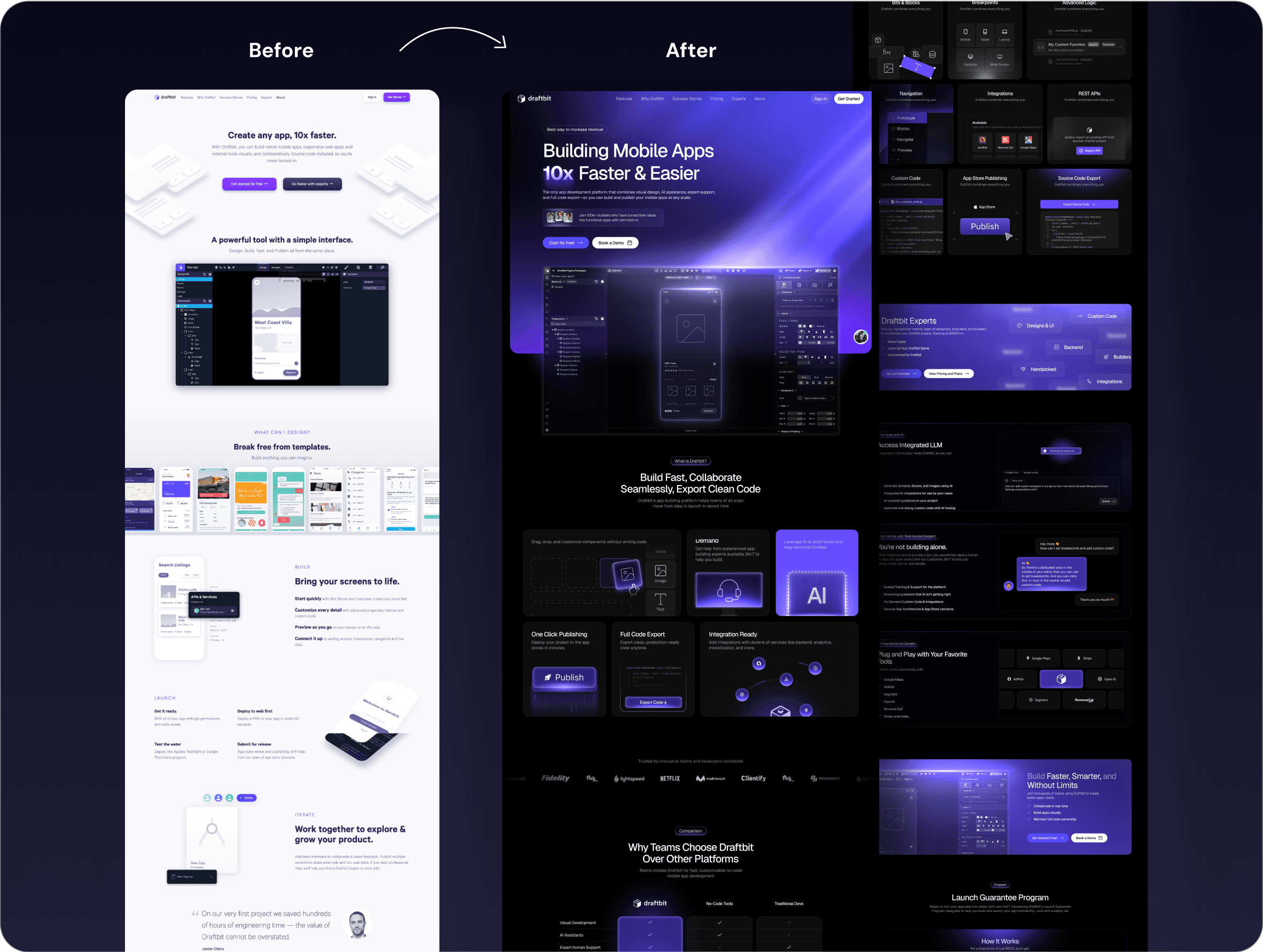
Before: Identifying the Problems
The original website had several issues hindering its performance:
1. Weak Value Proposition & Messaging
The headline, "Create any app, 10x faster", lacked emotional appeal and didn’t explain how it solved users’ pain points.
Overly technical language made it difficult for non-technical founders and designers to understand the benefits.
2. Unclear Call-to-Actions (CTAs)
Multiple CTAs like "Get Started for Free" and "Go Faster with Experts" created confusion.
No clear user journey, leading to high bounce rates.
3. Outdated Visual Design
Over-reliance on flat illustrations that looked generic and outdated.
Lacked interactive elements and motion design, which are crucial for a tech product.
4. Confusing Product Storytelling
Complex product features were explained in long paragraphs, overwhelming visitors.
No narrative that guided users from problem to solution, making it difficult to see the product’s full value.
5. Insufficient Social Proof
Testimonials were buried at the bottom, reducing their impact.
Lacked influential customer logos and case studies to build credibility.
6. Lack of Community & Developer Appeal
Didn’t highlight Draftbit’s community features or support systems, which are essential for no-code users.
No showcase of developer-friendly tools or integrations.
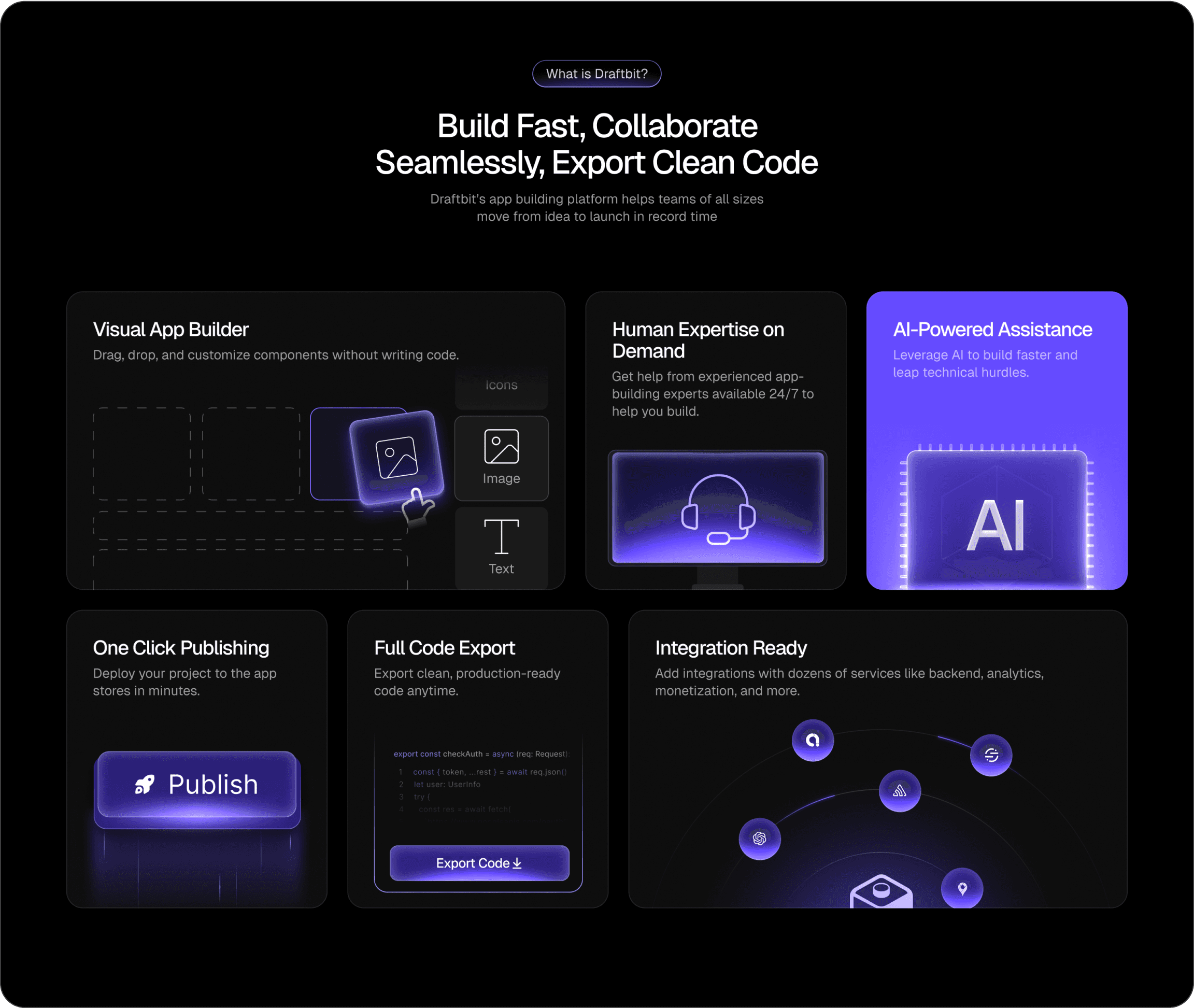
After: The Redesigned Website That 2x Conversions
We completely rebuilt the website with a bold, futuristic design, improved messaging, and a streamlined conversion flow.
1. Stronger Value Proposition & Messaging
✅ New headline: "Building Mobile Apps 10x Faster & Easier"
✅ Subheadline: "Skip the engineering hassle. Go from idea to app in days."
Clearly explains the main benefit (speed) and addresses the primary pain point (engineering complexity).
Uses active, benefit-driven language that resonates with both non-technical founders and product designers.
2. Streamlined & Clear CTA Structure
✅ Primary CTA: "Get Started for Free"
✅ Secondary CTA: "Schedule a Demo" for enterprise customers.
Clear and distinct CTAs guiding users to sign up or learn more about enterprise solutions.
Reduced friction by making the “Get Started” button more prominent throughout the user journey.
3. Futuristic Visual Design with Motion Graphics
✅ Introduced a dark, neon-themed UI that feels modern and technical.
✅ Added interactive Lottie animations that showcase the product in action.
Utilized a futuristic design style to position Draftbit as a next-gen app builder.
Integrated animations that demonstrate key features, increasing user engagement.
4. Engaging Product Storytelling
✅ Replaced text-heavy sections with visual storytelling and interactive infographics.
✅ Simplified product descriptions with step-by-step workflows.
Created a narrative that guides users from problem awareness to solution exploration.
Used product demos and GIFs to showcase the ease of building apps with Draftbit.
5. Enhanced Social Proof & Trust Signals
✅ Prominently displayed customer logos of well-known brands using Draftbit.
✅ Added video testimonials and case studies with tangible results.
Social proof was strategically placed next to CTAs to reinforce trust at decision points.
Featured customer success stories to illustrate real-world impact.
6. Community-Centric & Developer-First Approach
✅ Highlighted community features, including forums and dedicated support.
✅ Showcased developer integrations and API capabilities.
Positioned Draftbit as not just a tool but a community of builders and innovators.
Appealed to developers by emphasizing extensibility and technical integrations.
Results & Key Takeaways
The redesigned website achieved:
2x increase in conversion rate within the first month of launch.
30% boost in demo bookings due to clearer CTAs and social proof.
Higher engagement with an average time on page increase of 40%.
Stronger brand positioning as a futuristic, high-tech app builder.
With a focus on clear messaging, futuristic design, and community appeal, the new Draftbit website not only increased conversions but also strengthened brand loyalty among app builders and developers.