Humans Have Shorter Attention Spans Than Goldfish, Here's What That Means for Your Landing Page
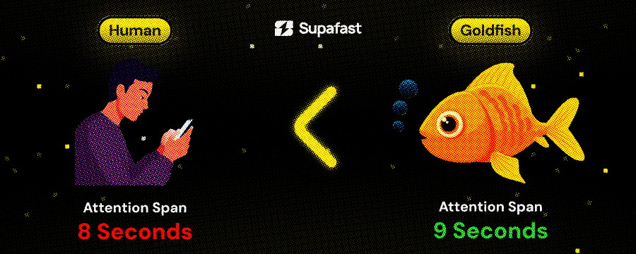
A goldfish has a 9-second attention span.
You have 8 seconds.
Let that sink in. Your potential customers scroll past your landing page faster than a goldfish loses interest in a pebble.
And you're wondering why your site doesn't convert.
Here's what's actually killing your conversion rate (and it's not what you think).
Most founders think short attention spans mean they need to:
Make everything shorter
Add more animations
Scream louder with bigger fonts
They're wrong. Here's the real formula:
Conversion Rate = (Clarity × Relevance) ÷ (Friction + Confusion)
In 8 seconds, visitors are asking three questions:
What is this? (Clarity)
Is this for me? (Relevance)
What do I do next? (Friction/Confusion)
If you don't answer all three in those 8 seconds, they're gone.
The myth: "People don't read anymore. Keep it short."
The reality: People watch 2-hour Joe Rogan podcast. They binge 14-hour Netflix series. They finish 300-page books in a weekend.
They don't have short attention spans. They have short consideration spans.
Which means: You have 8 seconds to earn the right for them to keep reading. But if you hook them, they'll read 2,000 words about your product.
I've seen this in our sales calls. One founder told me:
"I think like, people don't realize what am I selling... it's just confusing."
His site had short copy. Minimal text. Very "clean." And nobody understood what he did.
Another founder:
"Landing page makes it look sloppy. And I know that. The first thing people will see."
His problem wasn't attention span. It was clarity.
Element 1: The Fatal First Fold
Let's re-orient where we are in your landing page's structure:
Above the fold = Everything visible before scrolling.
This is your 8-second battleground.
What KILL conversions above the fold:
❌ Vague headers: If I read only your header and still don't know what you sell, you've lost me.
❌ Multiple CTAs: Decision fatigue in 3 seconds = I click nothing.
❌ No trust signals: Why should I trust you with my credit card?
What WORKS above the fold:
✅ One clear value prop: I know exactly what you do.
✅ One primary CTA: No confusion. One action. High contrast button.
✅ Immediate trust: You've de-risked clicking.
Before/After Example
Before (confusing):
Header: "The Modern Way to Build Software" Subheader: "Join the revolution" CTA: "Learn More"
After scanning for 5 seconds, I have no idea:
What software you build
Who it's for
What happens if I click "Learn More"
After (clear):
Header: "Turn Figma Designs Into React Components in Minutes"
Subheader: "No code translation errors. No designer-developer handoff delays. Just working components."
CTA: "See it in action" Trust: "Used by design teams at Stripe, Figma, and Notion"
Why it works:
I know what it does (Figma → React)
I know who it's for (design teams)
I know what I get (working components)
I see social proof (Stripe, Figma, Notion)
All in 8 seconds.
Element 2: The Scanning Pattern Reality
Here's what users actually do in those 8 seconds:
They don't read. They scan.
Eye-tracking studies show the F-pattern:
Horizontal: Read the top headline left to right
Horizontal: Skim the subheader or first line
Vertical: Scan down the left side looking for keywords
They're not reading your carefully crafted paragraphs. They're hunting for keywords that signal "this is for me."
How to design for scanners:
Pattern A: Strong headlines down the page
Ship 10x Faster (main headline) → No coding required (subheading) → Launch in 7 days (feature header) → Trusted by 50+ YC companies (trust header)
Each one hooks attention as they scan down.
Pattern B: Benefit bullets instead of paragraphs
❌ This:
Our platform enables teams to collaborate more effectively by providing real-time updates and seamless integration with your existing workflow tools.
✅ This:
Real-time team collaboration
Works with your existing tools
No setup required
Scannable in 2 seconds instead of 8.
Element 3: The Friction Killers
Even if your messaging is clear, friction kills conversions.
Friction = anything that makes the visitor think or wait.
Common friction points:
1. Slow load time
Every 1-second delay = 7% drop in conversions
Compress images
Remove heavy animations above fold
Load hero content first
2. Unclear next step
"What happens if I click this button?"
"Will they ask for my credit card?"
"Am I committing to anything?"
3. False bottoms
Page looks finished but there's more below
Add scroll indicators
Show partial next section
4. Mobile confusion
Tiny buttons
Cramped text
Horizontal scrolling
How to eliminate friction:
Make CTAs obvious:
❌ This button:
[ Learn More ]
What does "learn more" mean?
Where does it go?
What's the commitment?
✅ This button:
[ Book 15-Min Demo (No Card Required) ]
Clear outcome (demo)
Time commitment (15 min)
No risk (no card)
Show what happens next:
Add micro-copy under your CTA:
"See a demo → Talk to sales → Get access"
"Free 14-day trial → No credit card → Cancel anytime"
Remove the mystery. Kill the friction.
Element 4: The Mobile-First Reality
60% of your traffic is mobile. Your hero needs to work on a 375px screen.
What fits above the fold on mobile:
You get ~500px of vertical space before scroll.
That's room for:
Logo (60px)
Header (80px)
Subheader (60px)
CTA button (60px)
Trust signal (40px)
Padding/spacing (200px)
= 500px total
That's it. That's all you get for your 8-second pitch.
What doesn't fit:
❌ Hero image (pushes CTA below fold)
❌ Multiple CTAs (decision fatigue)
❌ Long paragraphs (nobody reads on mobile)
❌ Fancy animations (slows load time)
Mobile hero checklist:
✅ Header visible without scroll
✅ Primary CTA visible without scroll
✅ One trust signal visible
✅ Loads in < 2 seconds on 4G
✅ Button is thumb-sized (44px minimum)
✅ No horizontal scroll required
Test this yourself: Open your site on your phone. If you can't see the CTA without scrolling, you're losing mobile conversions.
Element 5: The Trust Gap
You have 8 seconds to answer: "Why should I trust you?"
B2B buyers are skeptical. They've been burned by:
Products that overpromise
Demos that waste their time
Sales calls that won't take no for an answer
Your job: De-risk clicking.
Trust signals that work above the fold:
1. Customer logos
"Trusted by teams at [Stripe] [Figma] [Notion]"
Not "Trusted by 1,000+ companies" (prove it with logos)
2. Specific proof
"Processing 2M API calls/month"
"Handling $50M+ in transactions"
"Deployed by 500+ engineering teams"
3. Risk removal
"14-day free trial. No credit card required."
"Book a 15-minute demo. No sales pitch."
"Cancel anytime. Full refund if not satisfied."
4. Social proof
"4.9/5 stars from 2,000+ reviews"
"Featured in TechCrunch, Forbes, Wired"
Video testimonials above the fold
The Action Plan
Here's your process to fix your landing page for 8-second attention spans:
Step 1: Audit your hero (10 minutes)
Run the four tests above:
▢ 5-second test
▢ Squint test
▢ Mobile check
▢ Objection hunt
Document what fails.
Step 2: Rewrite your header (20 minutes)
Use this formula:
[What you do] + [Specific outcome] + [Time frame]
Examples:
"Ship SaaS landing pages in 7 days, not 3 months"
"Turn customer feedback into product features in 48 hours"
"Deploy AI voice agents that sound human in 2 weeks"
Test: If someone reads only this, do they know exactly what you sell?
Step 3: Add one trust signal (10 minutes)
Pick the strongest one you have:
Customer logos (if they're recognizable)
Specific metric ("Processing 2M API calls/month")
Review score ("4.9/5 from 2,000+ users")
Add it in or just below the hero.
Step 4: Remove friction from CTA (10 minutes)
Rewrite your CTA to:
Use an action verb ("Book," "Watch," "Start")
Include outcome ("See Demo," "Get Access")
Add micro-copy removing risk ("No card required")
Step 5: Test on mobile (5 minutes)
Open your site on your phone. Can you see:
▢ Header
▢ CTA
▢ Trust signal
Without scrolling? If not, simplify.
Next Steps
If your landing page isn't converting:
Run the 8-second audit today. It takes 30 minutes.
Most founders discover they're losing 70%+ of visitors in the hero section alone.
Fix your hero. Watch your conversion rate climb.
Need help? If you're a SaaS/Tech founder who built an incredible product but your landing page "looks sloppy" (your words, not mine), we can help.
We ship landing pages that convert in 10 business days. Same process we used for the Sony investor story above.
P.S. The goldfish attention span study? It's been debunked. Goldfish actually have months of memory spans. But the metaphor still works: Your landing page needs to hook visitors faster than you think ;)